2023. 4. 27. 19:47ㆍ학습일지
1. font-size
- 텍스트 크기를 설정
- px, %, em, rem
font-family
- 텍스트 글꼴을 설정
<font size=4 color="#123456" face="굴림체">
✔️ 글꼴을 선택하는 방법
- 누구나 설치되어 있는 기본 글꼴을 사용
- 이미지로 처리
- 클라이언트에 글꼴을 다운로드 시켜 사용
- 웹 폰트를 사용
font-weight
- 텍스트의 굵기를 설정
- 기본 굵기: 400,(범위100~900)
구글폰트
- https://fonts.google.com/specimen/Sunflower?subset=korean¬o.script=Kore
<!DOCTYPE html>
<html lang="en">
<head>
    <meta charset="UTF-8">
    <meta http-equiv="X-UA-Compatible" content="IE=edge">
    <meta name="viewport" content="width=device-width, initial-scale=1.0">
    <title>css 텍스트</title>
    <link rel="preconnect" href="https://fonts.googleapis.com">
    <link rel="preconnect" href="https://fonts.gstatic.com" crossorigin>
    <link href="https://fonts.googleapis.com/css2?family=Sunflower:wght@300;500;700&display=swap" rel="stylesheet">

    <style>
        .sunflower1{font-family: 'Sunflower', sans-serif; font-weight:300;}
        .sunflower2{font-family: 'Sunflower', sans-serif; font-weight:500;}
        .sunflower3{font-family: 'Sunflower', sans-serif; font-weight:700;}

        @font-face {
        font-family: 'TTTtangsbudaejjigaeB';
        src: url('https://cdn.jsdelivr.net/gh/projectnoonnu/noonfonts_2212@1.0/TTTtangsbudaejjigaeB.woff2') format('woff2');
        font-weight: 300;
        font-style: normal;
        }
        .budaejjigae { font-family: 'TTTtangsbudaejjigaeB'; font-weight:300;}
    </style>

</head>
<body>
    <h2> css 텍스트 </h2>
    <p> 모든 사람은 인종, 피부색, 성, 언어, 종교, 정치적 또는 기타의 견해, 민족적 또는 사회적 출신, 재산, 출생 또는 기타의 신분과 같은 어떠한 종류의 차별이 없이, 이 선언에 규정된 모든 권리와 자유를 향유할 자격이 있다.</p>
    <p class="sunflower1">모든 사람은 인종, 피부색, 성, 언어, 종교, 정치적 또는 기타의 견해, 민족적 또는 사회적 출신, 재산, 출생 또는 기타의 신분과 같은 어떠한 종류의 차별이 없이, 이 선언에 규정된 모든 권리와 자유를 향유할 자격이 있다.</p>
    <p class="sunflower2">모든 사람은 인종, 피부색, 성, 언어, 종교, 정치적 또는 기타의 견해, 민족적 또는 사회적 출신, 재산, 출생 또는 기타의 신분과 같은 어떠한 종류의 차별이 없이, 이 선언에 규정된 모든 권리와 자유를 향유할 자격이 있다.</p>
    <p class="sunflower3">모든 사람은 인종, 피부색, 성, 언어, 종교, 정치적 또는 기타의 견해, 민족적 또는 사회적 출신, 재산, 출생 또는 기타의 신분과 같은 어떠한 종류의 차별이 없이, 이 선언에 규정된 모든 권리와 자유를 향유할 자격이 있다.</p>
    <p class="budaejjigae">모든 사람은 인종, 피부색, 성, 언어, 종교, 정치적 또는 기타의 견해, 민족적 또는 사회적 출신, 재산, 출생 또는 기타의 신분과 같은 어떠한 종류의 차별이 없이, 이 선언에 규정된 모든 권리와 자유를 향유할 자격이 있다.</p>
</body>
</html>
css배경
background- color
- HTML 요소의 배경색을 설정
<!DOCTYPE html>
<html lang="en">
<head>
    <meta charset="UTF-8">
    <meta http-equiv="X-UA-Compatible" content="IE=edge">
    <meta name="viewport" content="width=device-width, initial-scale=1.0">
    <title>CSS 배경1</title>
    <style>
        body { background-color: deeppink;}
        div{background-color: white;width:60px;padding:20px; border:3px solid red}
    </style>
</head>
<body>
    <h2> css 배경1</h2>
    <div>
        <h2>배경 적용하기</h2>
        <P>Lorem ipsum dolor sit amet consectetur, adipisicing elit. Iure odit pariatur quisquam repudiandae at accusamus dignissimos veritatis sed dolor inventore cumque aut dolorum, doloribus cum debitis cupiditate recusandae ipsa repellendus.</P>
    </div>
</body>
</html>
background-image
- HTML 요소의 배경으로 나타날 배경이미지를 설정
- 배경 이미지는 기본 설정으로 반복되어 나타남
background-image: url(파일경로)
background-repeat
- 배경 이미지를 수평이나 수직방향으로 반복하도록 설정(repeat-x, repeat-y, no-repeat)
<!DOCTYPE html>
<html lang="en">
<head>
    <meta charset="UTF-8">
    <meta http-equiv="X-UA-Compatible" content="IE=edge">
    <meta name="viewport" content="width=device-width, initial-scale=1.0">
    <title>css 배경2</title>
    <style>
        body{
            background-image: url(./이재욱.jpg) ;
            /* background-repeat: repeat-x;*/
             /* background-repeat: repeat-y;*/
             background-repeat: no-repeat;

        }
    </style>
</head>
<body>
    <h2> css 배경2</h2>
</body>
</html>
background-position
- 반복되지 않는 배경 이미지의 상대 위치를 설정
- %나 px을 사용해서 상대위치를 직접 설정할 수 있음
- 상대 위치를 결정하는 기준은 왼쪽 상당(left top)
left top center top right top
left center center right center
left bottom center bottom right bottom
background- position: center bottom
background- position: 가로위치값 세로위치값;
예) background-position:10% 100px;
<!DOCTYPE html>
<html lang="en">
<head>
    <meta charset="UTF-8">
    <meta http-equiv="X-UA-Compatible" content="IE=edge">
    <meta name="viewport" content="width=device-width, initial-scale=1.0">
    <title> css 배경3</title>
    <style>
        body {
            background-image: url(bus,png);
            background-repeat: no-repeat;
            background-position: fixed;
        }
        div{
            width:60%;
            height: 300px;
            border:3px dotted deeppink;
            padding:10px;
            margin-bottom: 20px;
            background-image:url(이재욱.jpg) ;
            background-repeat: no-repeat;
        }
        .bg1{  background-position: center bottom;}
        .bg2{  background-position: right bottom;}
        .bg3{  background-position: 20% 100px;}
    </style>
</head>
<body>
    <h2> css 배경3</h2>
        <div class ='bg1'>
            <h2>background-position 1</h2>
            <p>Lorem ipsum dolor sit amet, consectetur adipisicing elit. Dignissimos esse vel sit ut eius sapiente dolorem quasi eos labore amet officiis enim tempora, ipsa mollitia veritatis, omnis dolore sunt dicta!</p>
        </div>
        <div class ='bg2'>
            <h2>background-position 2</h2>
            <p>Lorem ipsum dolor sit amet consectetur adipisicing elit. Blanditiis quis tenetur soluta eveniet enim minus id quibusdam aperiam atque, quod asperiores recusandae commodi numquam suscipit alias veritatis. Eaque, ipsam deserunt.</p>
        </div>
        <div class ='bg3'>
            <h2>background-position 2</h2>
            <p>Lorem ipsum dolor sit amet consectetur adipisicing elit. Blanditiis quis tenetur soluta eveniet enim minus id quibusdam aperiam atque, quod asperiores recusandae commodi numquam suscipit alias veritatis. Eaque, ipsam deserunt.</p>
        </div>

</body>
</html>
background-attachment
- 위치가 설정된 배경 이미지를 원하는 위치에 고정시킬 수 있음
- 고정된 배경 이미지는 스크롤과 무관하게 화면의 위치에서 이동되지 않음
- fixed ,scroll
background-size
- 배경 이미지 크기를 설정
- px,%,contain,cover
- contain
* 배경 이미지의 가로, 세로 모두 요소보다 작다는 조건하에 가능한 설정
* 가로, 세로 비율은 유지
* 배경 이미지의 크기는 요소의 크기보다 항상 작거니 같음
- cover
* 배경 이미지의 가로, 세로, 길이 모두 요소보다 크다는 조건하에 가능한 설정
* 가로, 세로 비율은 유지
* 베경 이미지의 크기는 요소의 크기보다 항상 크거나 같음
background
- 배경 속성을 한꺼번에 적용
background 파일위치 반복여부 위치 사이즈...
margin: 100px auto;
https://pixabay.com/
박스모델(Box.Model)
- 모든 HTML 요소는 박스 모양으로 구성
- 박스 모델은 HTML 요소를 내용, 패딩, 테두리, 마진으로 구분함
내용(content)
- 텍스트나 이미지가 들어있는 박스의 실질적인 내용 부분
<p>안녕</p>
<!DOCTYPE html>
<html lang="en">
<head>
    <meta charset="UTF-8">
    <meta http-equiv="X-UA-Compatible" content="IE=edge">
    <meta name="viewport" content="width=device-width, initial-scale=1.0">
    <title>css 배경4</title>
    <style>
        div{
            background-image: url(이재욱.jpg);
            background-repeat: no-repeat;
            width: 150px;
            height: 150px;
            border:2px solid red;
            margin-bottom: 20px;
        }
        .background1{background-size:50px 100px;}
        .background2{background-size: 500px 500px; background-position: center;}
        .background3{background-size:contain;}
        .background4{
            width:100px;
            height: 70px;
            background-size: cover;
            background-position: bottom center;
        }

    </style>
</head>
<body>
    <h2> css배경4</h2>
    <div class="background1"></div>
    <div class="background2"></div>
    <div class="background3"></div>
    <div class="background4"></div>
</body>
</html>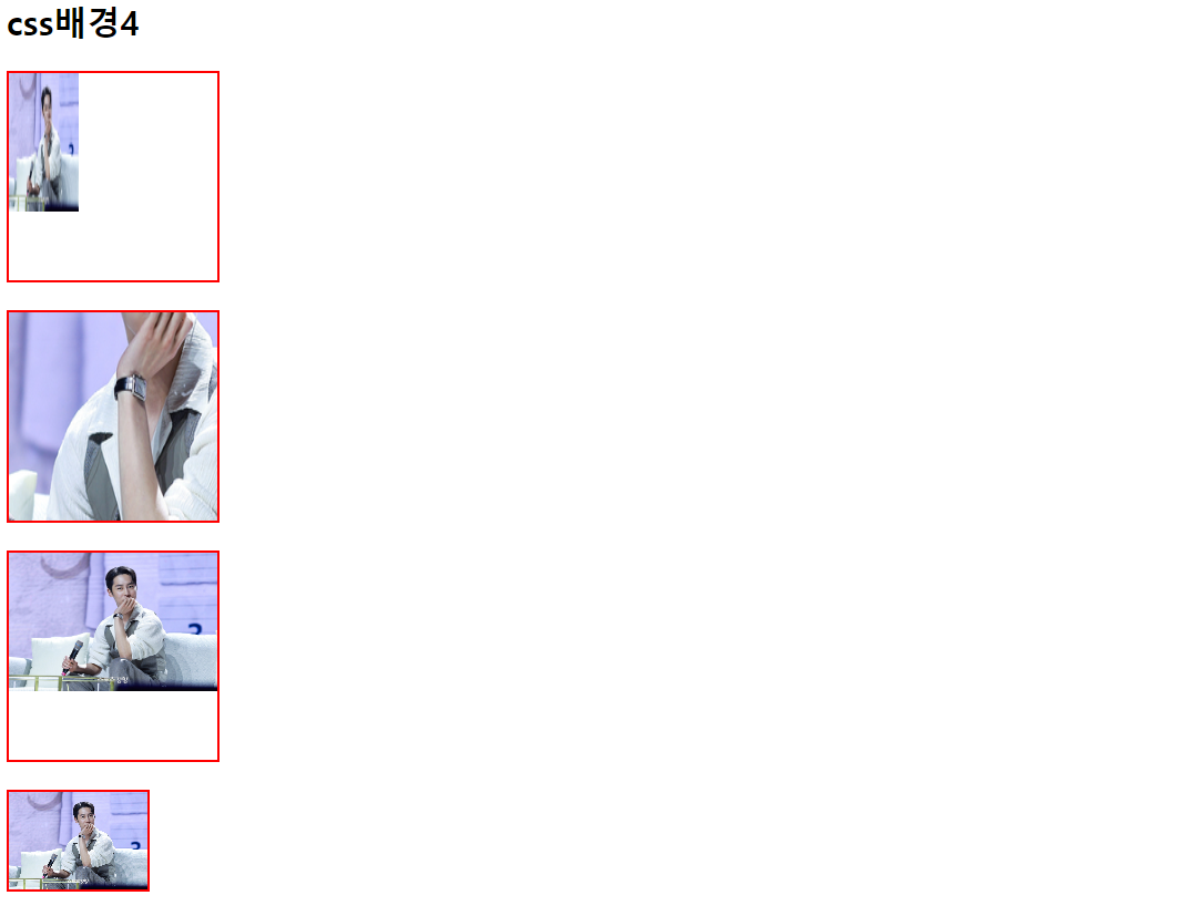
<!DOCTYPE html>
<html lang="en">
<head>
    <meta charset="UTF-8">
    <meta http-equiv="X-UA-Compatible" content="IE=edge">
    <meta name="viewport" content="width=device-width, initial-scale=1.0">
    <title>css 배경5</title>
    <style>
        html{
            background: url(이재욱.jpg) no-repeat center fixed;
            background-size: cover;
        }
    </style>
</head>
<body>

</body>
</html>
패딩(padding)
- 내용과 테두리 사이의 간격
- padding-top, padding=right, padding-bottom, padding-left
- padding: 위 오른쪽 아래 왼쪽순으로 설정
div#padding{ padding: 20px 50px 30px 10px;}
위 20px 오른쪽 50px 아래 30px 왼쪽 10px
div#padding{ padding: 20px 50px 30px ;}
위 20px 오른쪽 50px 아래 30px
div#padding{ padding: 20px 50px ;}
위 20px 오른쪽 50px
div#padding{ padding: 20px ;}
위 20px 오른쪽20px 아래 20px 왼쪽 20px
HTML
<div id="padding">안녕하세요</div>
<!DOCTYPE html>
<html lang="en">
<head>
    <meta charset="UTF-8">
    <meta http-equiv="X-UA-Compatible" content="IE=edge">
    <meta name="viewport" content="width=device-width, initial-scale=1.0">
    <title>패딩</title>
    <style>
        div{
            width:200px;
            height: auto;
            background-color: deepskyblue;
            margin:20px;
            color:white;
        }
        #padding1{ padding:10px 30px 20px 40px;}
        #padding2{ padding:20px 30px 40px;}
        #padding3{ padding: 30px 50px;}
    </style>
</head>
<body>
    <h2> 패딩</h2>
    <div id = "padding1">
        Lorem ipsum dolor sit amet consectetur adipisicing elit. Fugit, esse veniam itaque id consequatur ducimus, repellendus ipsum sequi amet dicta asperiores facilis, modi ipsa odit nulla animi placeat maiores. Doloremque!
    </div>
    <div id = "padding2">
        Lorem ipsum dolor sit amet consectetur adipisicing elit. Fugit, esse veniam itaque id consequatur ducimus, repellendus ipsum sequi amet dicta asperiores facilis, modi ipsa odit nulla animi placeat maiores. Doloremque!
    </div>
    <div id = "padding3">
        Lorem ipsum dolor sit amet consectetur adipisicing elit. Fugit, esse veniam itaque id consequatur ducimus, repellendus ipsum sequi amet dicta asperiores facilis, modi ipsa odit nulla animi placeat maiores. Doloremque!
    </div>
</body>
</html>

테두리 (border)
- 내용(content)과 패딩(padding) 주변을 감싸는 테두리
- border-style(테두리 모양), border-color(테두리 색상), border-width(테두리 두께), border(한꺼번에 설정)
<!DOCTYPE html>
<html lang="en">
<head>
    <meta charset="UTF-8">
    <meta http-equiv="X-UA-Compatible" content="IE=edge">
    <meta name="viewport" content="width=device-width, initial-scale=1.0">
    <title>테두리t</title>
    <style>
        div {
            width : 200px;
            height: 100px;
            margin: 15px;
            border-width: 5px;
            color: black;
        }
        #border1 { border-style:solid;}
        #border2 { border-style:dotted;}
        #border3 { border-style:dashed;}
        #border4 { border-style:double;}
        #border5 { border-color:gold;
                border-top-style: dotted;
                border-right-style: solid;
                border-bottom-style:dashed;
                border-left-style:double;
        }
        #border6{ border:3px dotted red;}
    </style>
</head>
<body>
    <h2>테두리</h2>
    <div id="border1"></div>
    <div id="border2"></div>
    <div id="border3"></div>
    <div id="border4"></div>
    <div id="border5"></div>
</body>
</html>
마진(margin)
- 테두리(border)와 이웃하는 요소들 사이의 간격
- 마진은 눈에 보이지 않음
- 세로 겹침 현상이 나타남
✔️ 세로 겹침 현상
세로로 나열된 두 박스의 간격은 두 마진의 합이 아니라 둘 중 큰 값을 선택하는 현상
<!DOCTYPE html>
<html lang="en">
<head>
    <meta charset="UTF-8">
    <meta http-equiv="X-UA-Compatible" content="IE=edge">
    <meta name="viewport" content="width=device-width, initial-scale=1.0">
    <title>마진</title>
    <style>
        body{ padding:0; margin:0;}
        div{
        width: 200px;
        height: 100px;
        background-color: deepskyblue;
    }
    #margin1{ margin: 30px 50px 30px 50px;}
    #margin2{ margin: 30px 50px;}
    #margin3{ margin: 50px;}
    #margin4{ margin: 30px 5px 10px;}
    #margin5{ margin: 30px auto;}
    </style>

</head>
<body>
    <h2>마진</h2>
    <div id="margin1"></div>
    <div id="margin2"></div>
    <div id="margin3"></div>
    <div id="margin4"></div>
    <div id="margin5"></div>

</body>
</html>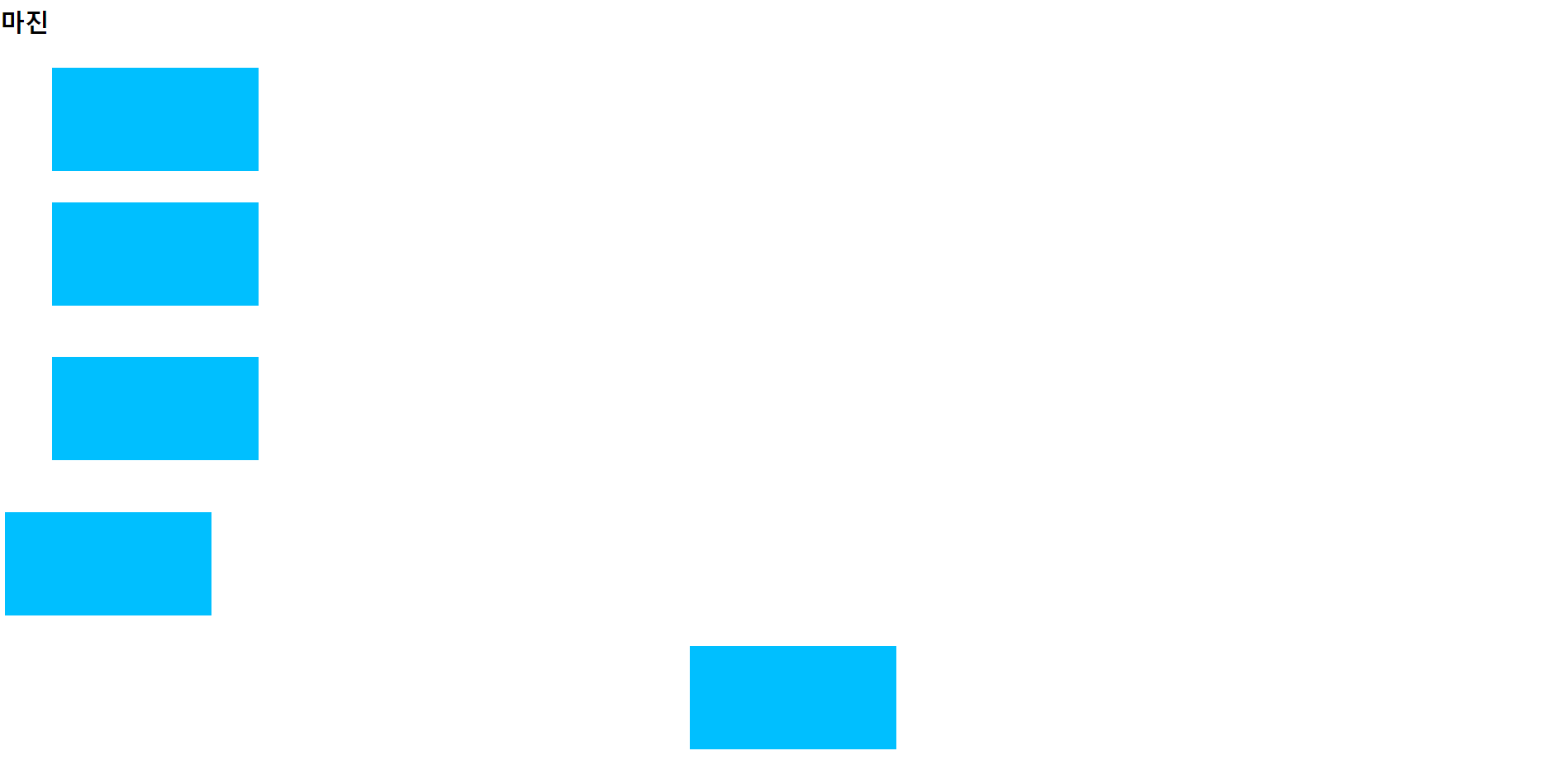
박스사이징(box-sizing)
- width, height 값에 padding,border 영역을 포함되지 않음
- 만약 width가 100%로 설정되는 경우 padding이나 border 속성을 추가하면 안됨
- box-sizing 속성값을 border-box로 설정하면 width와 height값에 padding과 border를 포함
<!DOCTYPE html>
<html lang="en">
<head>
    <meta charset="UTF-8">
    <meta http-equiv="X-UA-Compatible" content="IE=edge">
    <meta name="viewport" content="width=device-width, initial-scale=1.0">
    <title>박스사이징</title>
    <style>
        div{
        width:300px;
        height:150px;
        margin:10px;
        padding:30px;
        border: 3px solid red;
        }
    </style>
</head>
<body>
    <h2> 박스 사이징 </h2>
    <div id=":boxsizing1"> box-sizing='content-box'</div>
    <div id=":boxsizing2"> box-sizing='border-box'</div>
</body>
</html>
css 디스플레이
- 웹 페이지에 레이아웃을 결정하는 속성
- block.inline,inline-block,none
✔️ visibility: hidden; -> visibility: visible;
아이디 [ apple ] [중복 검색]
사용할 수 있는 아이디입니다.
비밀번호[ **** ]
<!DOCTYPE html>
<html lang="en">
<head>
    <meta charset="UTF-8">
    <meta http-equiv="X-UA-Compatible" content="IE=edge">
    <meta name="viewport" content="width=device-width, initial-scale=1.0">
    <title>디스플레이</title>
    <style>
        div{
            background-color: deepskyblue;
            border: 3px solid red;
            margin-bottom: 30px;
        }
        p#none{display: none;}
        p#none{visibility: none;}
    </style>
</head>
<body>
    <h2>디스플레이</h2>
    <div>
        <p>display 속성값을 none으로 설정</p>
        <p id="none">display 속성값을 none으로 설정</p>
    </div>
    <div>
        <p>display 속성값을 none으로 설정</p>
        <p id="none">display 속성값을 none으로 설정</p>
    </div>
</body>
</html>
CSS 폼
- 폼 요소의 스타일 설정
<!DOCTYPE html>
<html lang="en">
<head>
    <meta charset="UTF-8">
    <meta http-equiv="X-UA-Compatible" content="IE=edge">
    <meta name="viewport" content="width=device-width, initial-scale=1.0">
    <title>폼</title>
    <style>
        .input {
            box-sizing: border-box;
            width: 100%;
            background-color: aquamarine;
            padding: 10px 20px;
            margin: 5px 0;
        }
        input[type="text"]{
            border-radius: 15px;
        }
        input[type="text"]:focus{
            background-color: greenyellow;
            border: 3px dotted black;
        }
        input[type="password"]{
            border: none;
            background-color: white;
            border-bottom: 3px solid black;
        }
        input[type="password"]:focus{
            border-bottom: 3px dotted black;
        }
        select {
            box-sizing: border-box;
            width: 100%;
            padding: 10px;
            background-color: pink;
            margin: 5px 0;
            border: 2px solid deeppink;
        }
        textarea#content {
            box-sizing: border-box;
            width: 100%;
            height: 200px;
            resize: none;
            font-size: 20px;
        }
        button.btn {
            width: 150px;
            background-color: palevioletred;
            color: white;
            padding: 12px 25px;
            cursor: pointer;
            border: none;
        }
        p.center { text-align: center;}
    </style>
</head>
<body>
    <h2>폼</h2>
    <form action="#">
        <p>아이디: <input type="text" id="userid" class="input" maxlength="20" placeholder="아이디를 입력하세요"></p>
        <p>비밀번호: <input type="password" id="userpw" class="input" maxlength="20" placeholder="비밀번호를 입력하세요"></p>
        <p>직업:
            <select>
                <option value="프로그래머">프로그래머</option>
                <option value="디자이너">디자이너</option>
                <option value="학생">학생</option>
                <option value="유튜버">유튜버</option>
                <option value="학생">학생</option>
            </select>
        </p>
        <p><textarea id="content"></textarea></p>
        <p class="center"><button class="btn">회원가입</button></p>
    </form>
</body>
</html>
css position
- 요소의 위치를 결정하는 방식을 설정
1. 정적 위치 지정 방식
- static podition, 기본값
-HTML 요소의 위치를 결정하는 기본적인 방식
- 단순히 웹 페이지의 흐름에 따라 차례때로 요소들이 위치를 결정하는 방식
2. 상대 위치 지정방식
- relative position
- HTML 요소의 기본 위치(정적 위치 지정방식)를 기준으로 위치를 재설정 하는 방식
- TOP,LEFT.RIGHT,BOTTOM 속성값을 사용하여 재설정
<!DOCTYPE html>
<html lang="en">
<head>
    <meta charset="UTF-8">
    <meta http-equiv="X-UA-Compatible" content="IE=edge">
    <meta name="viewport" content="width=device-width, initial-scale=1.0">
    <title>상대 위치 지정 방식</title>
    <style>
        div{
            width:200px;
            padding:20px;
        }
        .relatives1{
            background-color: deeppink;
        }
        .relatives2{
            position: relative;
            background-color: deepskyblue;
            left:200px;
            top:100px;
        }
        .relatives3{
            position:relative;
            background-color: gold;
            right:100px;
            bottom:50px;
        }
    </style>
</head>
<body>
    <h2>상대 위치 지정 방식</h2>
    <div class="relatives1">상대 위치 지정방식1</div>
    <div class="relatives2">상대 위치 지정방식2</div>
    <div class="relatives3">상대 위치 지정방식3</div>
    <div class="relatives4">상대 위치 지정방식4</div>
</body>
</html>
3. 고정 위치 지정방식
- fixed podition
- 웹 페이지가 스크롤 되어도 고정위치로 지정된 요소는 항상 같은 곳에 위치
- 뷰포트를 기준으로 위치를 설정하는 방식
- 뷰포트를 기준으로 위치를 설정하는 방식
- TOP,LEFT.RIGHT,BOTTOM 속성값을 사용할 수 있음
<!DOCTYPE html>
<html lang="en">
<head>
    <meta charset="UTF-8">
    <meta http-equiv="X-UA-Compatible" content="IE=edge">
    <meta name="viewport" content="width=device-width, initial-scale=1.0">
    <title>고정 위치 지정 방식</title>
    <style>
    #fx{
        position:fixed;
        width:100px;
        height:200px;
        background-color: gold;
        right:10px;
        bottom:10px;


    }
</style>
</head>
<body>
    <h2>고정 위치 지정 방식</h2>
    <div id="fx"></div>
    <div id="contnet"><P>Lorem ipsum dolor sit amet consectetur adipisicing elit. Voluptatem nihil quia quo laborum, repellendus delectus alias facilis vel! Molestiae dolore id illo modi reiciendis quia nulla eius iste dicta sint.</P>
    <P>Lorem ipsum dolor sit amet consectetur adipisicing elit. Voluptatem nihil quia quo laborum, repellendus delectus alias facilis vel! Molestiae dolore id illo modi reiciendis quia nulla eius iste dicta sint.</P>
    <P>Lorem ipsum dolor sit amet consectetur adipisicing elit. Voluptatem nihil quia quo laborum, repellendus delectus alias facilis vel! Molestiae dolore id illo modi reiciendis quia nulla eius iste dicta sint.</P>
    <P>Lorem ipsum dolor sit amet consectetur adipisicing elit. Voluptatem nihil quia quo laborum, repellendus delectus alias facilis vel! Molestiae dolore id illo modi reiciendis quia nulla eius iste dicta sint.</P>
    <P>Lorem ipsum dolor sit amet consectetur adipisicing elit. Voluptatem nihil quia quo laborum, repellendus delectus alias facilis vel! Molestiae dolore id illo modi reiciendis quia nulla eius iste dicta sint.</P>
</div>

</body>
</html>
4. 부모태그를 이용한 고정 위치 지정
- sticky position
- fixed가 브라우저 화면의 절대 위치를 사용하는 반면 sticky는 부모 태그의 절대 위치값을 사용하는 방식
- 익스플로러에서는 작동하지 않음
<!DOCTYPE html>
<html lang="en">
<head>
    <meta charset="UTF-8">
    <meta http-equiv="X-UA-Compatible" content="IE=edge">
    <meta name="viewport" content="width=device-width, initial-scale=1.0">
    <title>sticky</title>
    <style>
        html.body{margin:0; padding:0;}

        .header{
            height:80px;
            background-color: gold;

        }
        .container{
            display:flex;
            flex-flow: row nowrap;
        }
        .content{
            box-sizing: border-box;
            width: 80px;
            height: 800px;
            background-color: deepskyblue;

        }
        .sidebar{
            position: sticky;
            box-sizing: border-box;
            width:20%;
            background-color: deeppink;
            height:400px;
            top:0;/* 상위 부모 컨테이너의 가장 상단에서부터 적용*/
        }
        .footer{
            background-color: greenyellow;
            height:200px;
        }
    </style>
</head>
<body>
    <header class="header">헤더</header>
    <main class="container">
        <section class="content">메인 컨텐츠</section>
        <asied class="sidebar">sticky 적용하기</asied>
    </main>
    <footer class="footer">푸터</footer>
</body>
</html>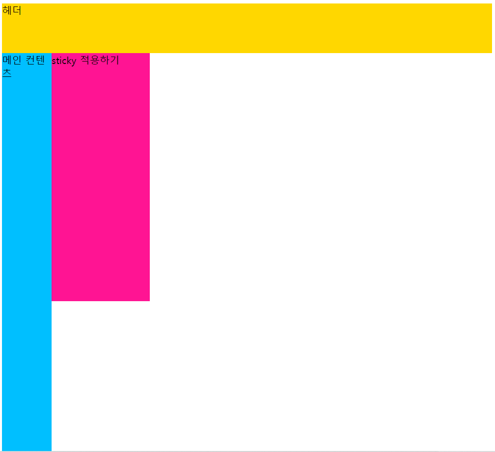

5. 절대 위치 지정방식
- absolute position
- 뷰포트를 기준으로 위치를 설정하는 방식
- 조상요소를 기준으로 위치를 지정할 수 있음
- 조상요소를 가지지 않으면 body 요소를 기준으로 위치를 결정
- 조상요소를 기준으로 위치를 지정하려면 조상요소는 반드시 정적 위치 지정 방식이 아니여야 함
- top, left, right, bottom 속성값을 사용할 수 있음
<!DOCTYPE html>
<html lang="en">
<head>
    <meta charset="UTF-8">
    <meta http-equiv="X-UA-Compatible" content="IE=edge">
    <meta name="viewport" content="width=device-width, initial-scale=1.0">
    <title>절대 위치 지정 방식</title>
    <style>
        #wrap{
            position: relative;
            width: 500px;
            height: 500px;
            border:3px solid red;
        }
        .box{
            position: absolute;
            width: 50px;
            height: 50px;
            background-color: deeppink;
        }
        #ab1{ top:0; right:0;}
        #ab2{ bottom:0; left:0;}
        #ab3{ bottom:0; right:0;}
        #ab4{ top:100px; left:150px;}

            </style>
</head>
<body>
    <h2> 절대 위치 지정 방식</h2>
    <div id ="wrap">
        <div class="box" id="ab1"></div>
        <div class="box" id="ab2"></div>
        <div class="box" id="ab3"></div>
        <div class="box" id="ab4"></div>
        <div class="box" id="ab5"></div>
    </div>

</body>
</html>
z-index
- HTML 요소의 위치를 설정하게 되면 위치 및 방식에 따라 요소가 겹칠 수 있음
- 겹쳐지는 요소들이 쌓이는 순서를 결정할 때 z-index를 사용
- 순서는 숫자의 크기가 클수록 위에 위치하고 작을 수록 아래 위치하게 됨
<!DOCTYPE html>
<html lang="en">
<head>
    <meta charset="UTF-8">
    <meta http-equiv="X-UA-Compatible" content="IE=edge">
    <meta name="viewport" content="width=device-width, initial-scale=1.0">
    <title>z-index</title>
    <style>
        div#wrapper{position:relative;}
        div.box{
            position: absolute;
            width: 200px;
            height: 200px;
            border: 1px solid black;
            font-size:25px;
        }
       #b1{
            left: 50px;
            top: 50px;
            background-color: deeppink;
            z-index:10;
        }
        #b2{
            left: 120px;
            top: 70px;
            background-color: gold;
            z-index:100;
        }
        #b3{
            left: 70px;
            top: 110px;
            background-color:green;
            z-index:5;
        }

    </style>
</head>
<body>
    <h2> z-index</h2>
    <div id="wrapper">
        <div id="b1" class="box">1번째 div</div>
        <div id="b2" class="box">2번째 div</div>
        <div id="b3" class="box">3번째 div</div>
    </div>
</body>
</html>
float
- HTML 요소가 주변(수평으로 나열된)의 다른 요소들과 자연스럽게 어울리도록 만들기 위해 사용
- float를 적용받은 요소의 다음에 나오는 모든 요소들이 끌어올려짐
- float를 적용받은 요소의 방향을 결정(left,right)
- 컨텐츠 크기 만큼만 영역을 설정(블록)
- float를 적용받은 요소는 다른 요소보다 위쪽에 위치(배경보다 위)
<!DOCTYPE html>
<html lang="en">
<head>
    <meta charset="UTF-8">
    <meta http-equiv="X-UA-Compatible" content="IE=edge">
    <meta name="viewport" content="width=device-width, initial-scale=1.0">
    <title>float1</title>
    <style>
        img{
            float: left;

        }
    </style>
</head>
<body>
    <h2> float1</h2>
    <img src="sea-2052650_1280.jpg" alt="고래"> Lorem, ipsum dolor sit amet consectetur adipisicing elit. Repellat magnam maiores nisi perspiciatis animi! Natus sequi necessitatibus illum adipisci animi vero tenetur cum unde debitis nemo officia illo, culpa delectus.
</body>
</html>
<!DOCTYPE html>
<html lang="en">
<head>
    <meta charset="UTF-8">
    <meta http-equiv="X-UA-Compatible" content="IE=edge">
    <meta name="viewport" content="width=device-width, initial-scale=1.0">
    <title>float2</title>
    <style>
        #box1{
            padding: 20px;
            background-color:gold;
            float:left;
            margin-right: 20px;
        }
        #box2{
            padding: 20px;
            background-color:deepskyblue;
            float: left;
            margin-right: 20px;
        }
        #box3{
            padding: 20px;
            background-color:deeppink;
            float:left;
        }
        #box4{
            padding: 20px;
            background-color:green;
            float:right;
        }
    </style>
</head>
<body>
    <h2>float2</h2>
    <div id="box1">박스-1</div>
    <div id="box2">박스-2</div>
    <div id="box3">박스-3</div>
    <div id="box4">박스-4</div>
</body>
</html>
clear
- float 속성이 적용된 이후 나타나는 요소들의 동작을 조절
- float 속성이 적용되면 그 이후에 등장하는 모든 요소들은 정확한 위치를 설정하기 힘듬
-clear 속성을 이용하여 float 이후에 등장하는 요소들이 더이상 float 속성에 영향을 받지 않도록 설정(left,right,both)
<!DOCTYPE html>
<html lang="en">
<head>
    <meta charset="UTF-8">
    <meta http-equiv="X-UA-Compatible" content="IE=edge">
    <meta name="viewport" content="width=device-width, initial-scale=1.0">
    <title>clear</title>
    <style>
        body{ margin: 20px 30px; max-width:800px;}
        p{
            padding: 10px;
            text-align: center;
            font-size: 18px;
        }
        #p1{
            float:left;
            width:38%;
            background-color:gold;
        }
        #p2{
            float:right;
            width:54%;
            background-color:deepskyblue;
        }
        #p3{
            clear:both;
            background-color:deeppink;
        }
    </style>
</head>
<body>
    <h2>clear</h2>
    <div id="p1">Lorem ipsum dolor sit amet consectetur adipisicing elit. Culpa dolores modi error sit! Animi, aspernatur provident sed qui quasi laboriosam amet eos, atque saepe suscipit eligendi eveniet ratione, nemo commodi.</div>
    <div id="p2">Lorem ipsum dolor sit amet consectetur adipisicing elit. Iure tenetur aliquam fugit aliquid? Assumenda, corporis aspernatur. Officia odit doloremque quisquam debitis cumque, nostrum iusto amet esse quam aliquid nam maxime.</div>
    <div id="p3">Lorem ipsum dolor sit amet consectetur adipisicing elit. Fuga, voluptate, autem error temporibus harum similique sequi sunt impedit velit et veniam dicta? Nam animi nihil sapiente natus tempore fugiat labore.</div>
</body>
</html>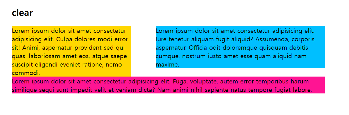
'학습일지' 카테고리의 다른 글
| 20230328 kdt 학습 일지 (1) | 2023.04.21 |
|---|---|
| 20230327 kdt 학습일지 (2) | 2023.03.27 |
| 20230324 kdt 학습일지 (1) | 2023.03.24 |
| 20230323 kdt 수업일지 (0) | 2023.03.23 |
| 20230322 KDT 학습일지 (0) | 2023.03.22 |